YARD CERAMICS
FOUNDER OF E-COMMERCE
_Social media strategy,
website design,
marketing campaign
Tools used:
○ Shopify○ Adobe Lightroom
○ Canva

Yard Ceramics is an e-commerce and brand I founded to sell hand thrown pottery. Solely responsible for the end-to-end process, I developed its branding, visual identity, and marketing strategy.
Opportunity
My brother is a potter. On one hand, I wanted to increase his reach, and on the other, I was itching to dabble in product photography and start an e-commerce︎︎︎ again︎︎︎︎︎︎.
The idea to launch a brand to sell his work was born in lockdown period (Covid-19). Consequently, I decided to run a marketing campaign in conjunction with the launch to fundraise for a local charity organisation.
Responsibilities
Helming the business, I was responsible for the end-to-end process, including branding, website design, marketing, and fulfilment. Here’s a peek into some of my thought processes:
Branding
○ Naming it Yard
The ceramics are hand thrown and sculpted in our backyard, so that’s where the name comes from. Yard is also memorable and warm.
○ Photography
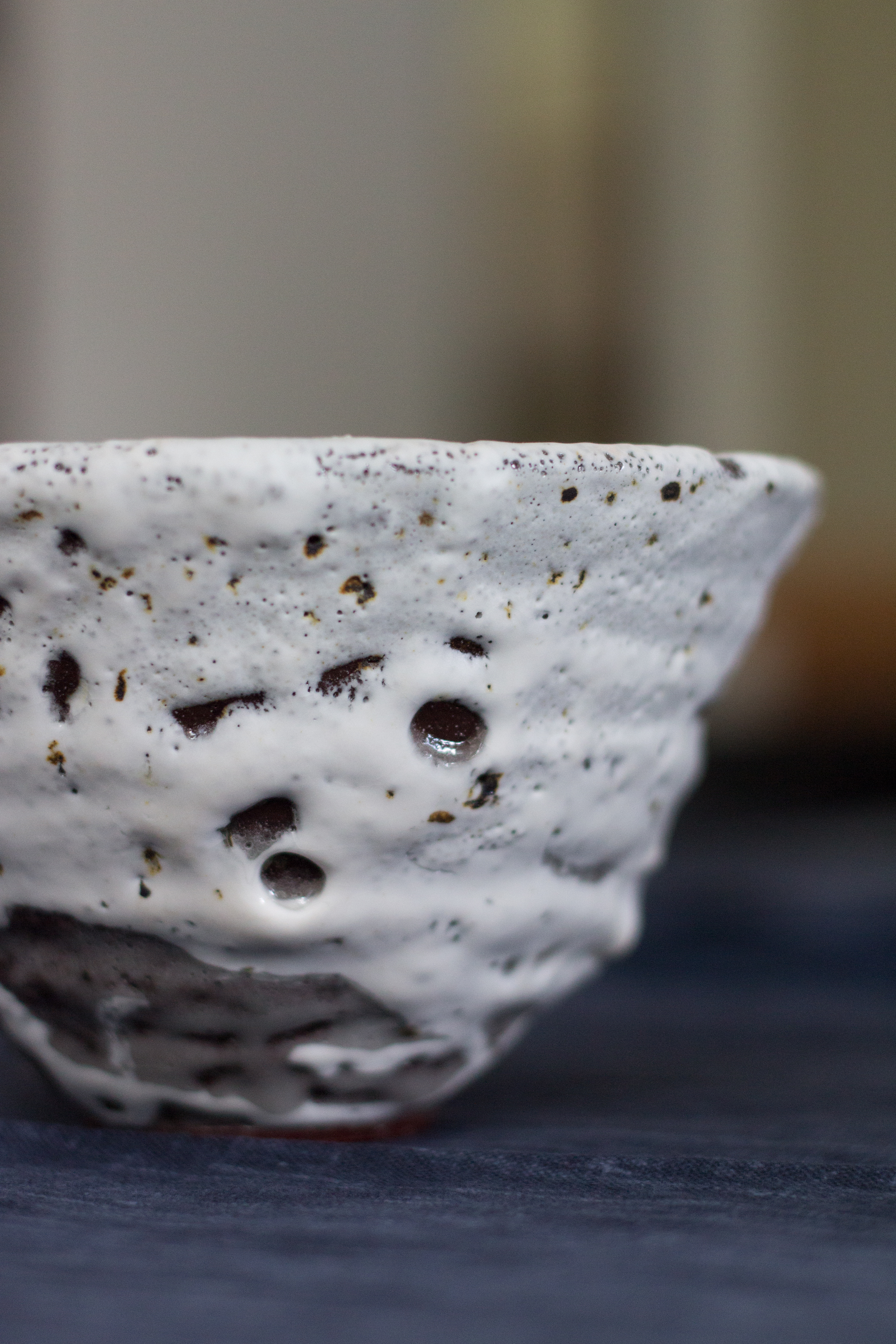
Photographs were taken in natural lighting with a few homely backgrounds, showcasing the textures and individuality of the pieces. Edited lightly on Adobe Lightroom. ︎︎︎


○ Visual branding
Large and simple typography, that plays a complementary role to direct more attention to the photography.
Website design
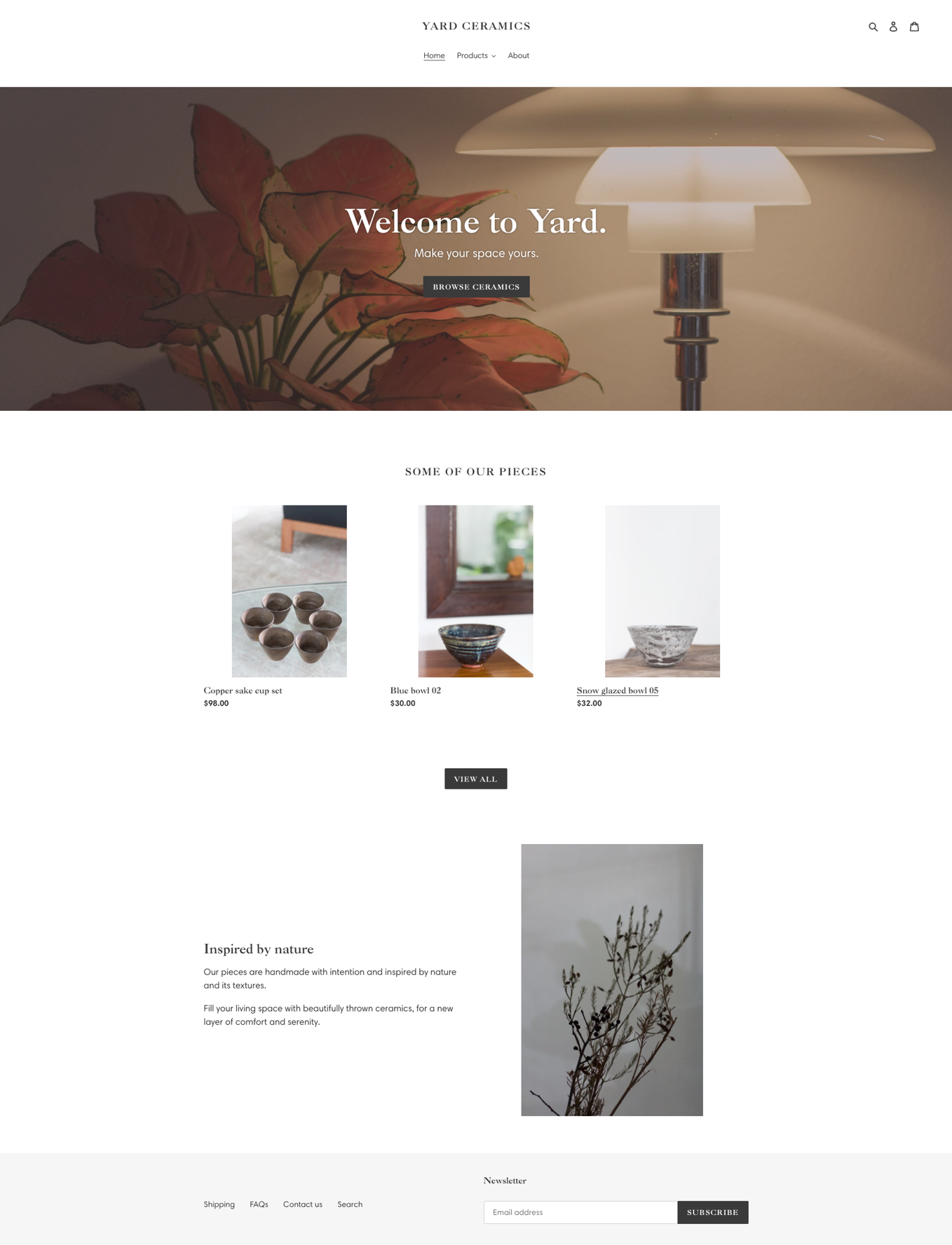
I built the first iteration of the e-commerce on Shopify in a night, featuring key navigation pages such as the homepage, shipping information, About page, and listed a few products to start off with.
○ User experience
Here I’ll share how I designed my homepage, product categories, and Frequently Asked Questions pages.
Homepage:
Designed three blocks with intent:
○ Atmospheric photography was chosen for the hero image to evoke warmth; main call to action is a button to view all available products
○ A preview of available products, with a button to view all available products
○ A branding element featuring copy and another comforting atmospheric imagery
The call-to-action buttons direct the customers to view all available products only for an enhanced user experience. Seeing that all our products are limited to one piece and tend to sell out quickly, it might drive customers away if the products on the first few pages they view are sold out. ︎︎︎

Product categories:
They were sorted into user-friendly categories which aid in the browsing experience. Beyond the item types, there were the following:
○ Latest drop for new collections
○ Available for all currently available products
○ All to view all
Frequently Asked Questions:
Grouped according to user-friendly categories such as Payment and Order, Shipping, and Returns and Refunds.
Fundraising marketing campaign: Instagram and Facebook
As the brand was started during lockdown period, it felt right to contribute proceeds to a charity organisation for larger social benefit.
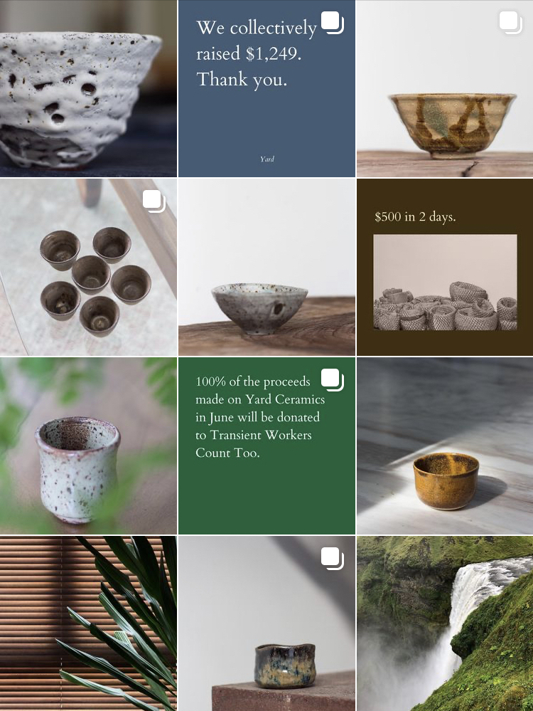
Over two weeks in June 2020, I ran marketing campaigns on Instagram and Facebook to raise $1,249 for Transient Workers Count Too, a non-profit organisation in Singapore dedicated to improving conditions for low-wage migrant workers. ︎︎︎
Lessons
Motivation for starting and following through with self-initiated projects could be helped with clear goal-setting and set constraints.
This experience also rekindled my love for creative direction, brand-building, and product photography.
︎︎︎I enjoy operations and the tactility of a retail business.
︎︎︎︎︎︎I started a short-lived but profitable fashion business when I was 16 years old and on my gap year.
